Weltformat Graphic Design Festival
Print to Motion Poster
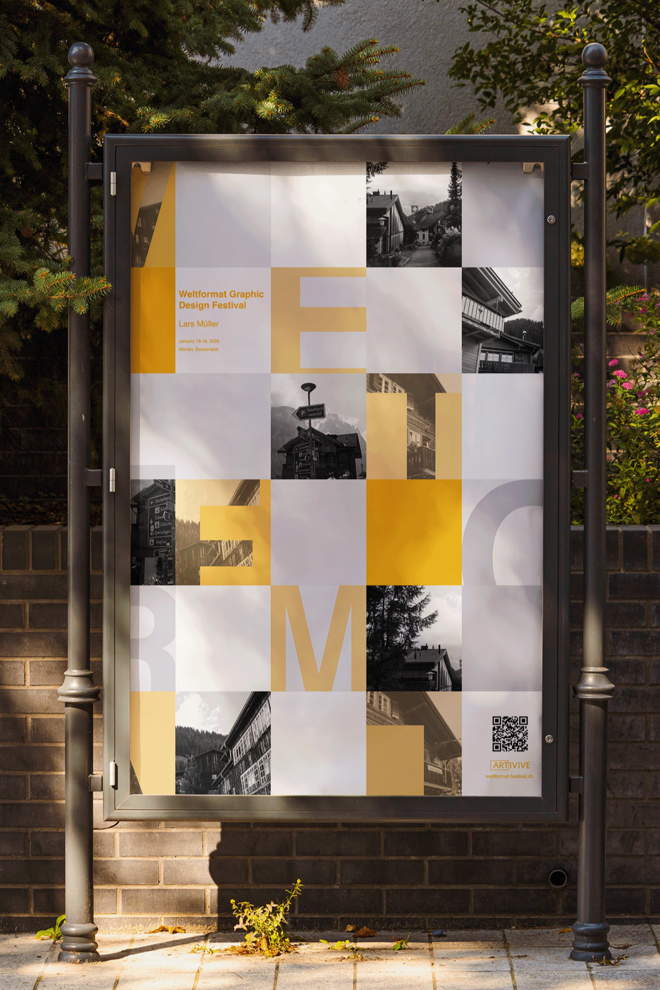
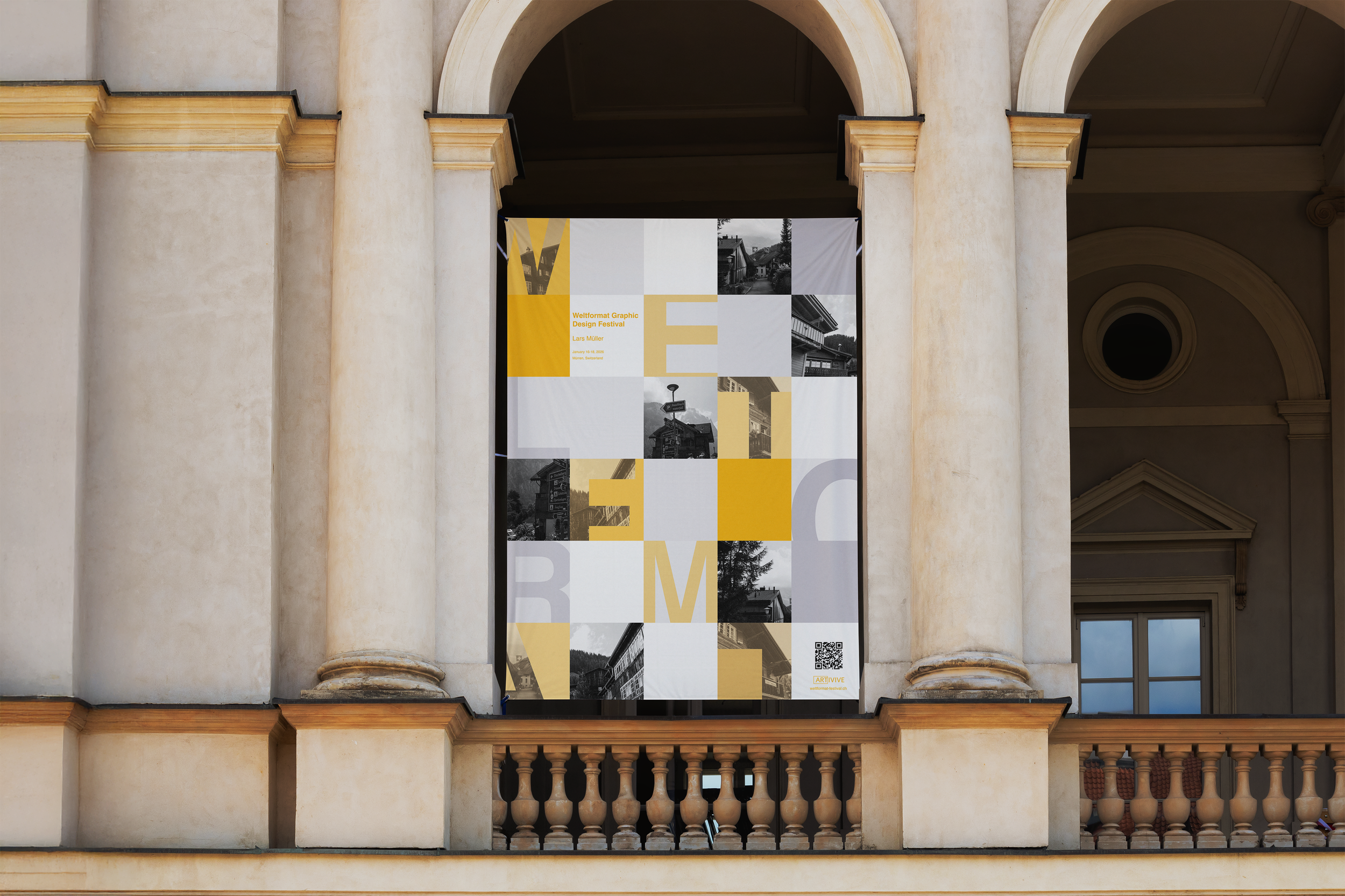
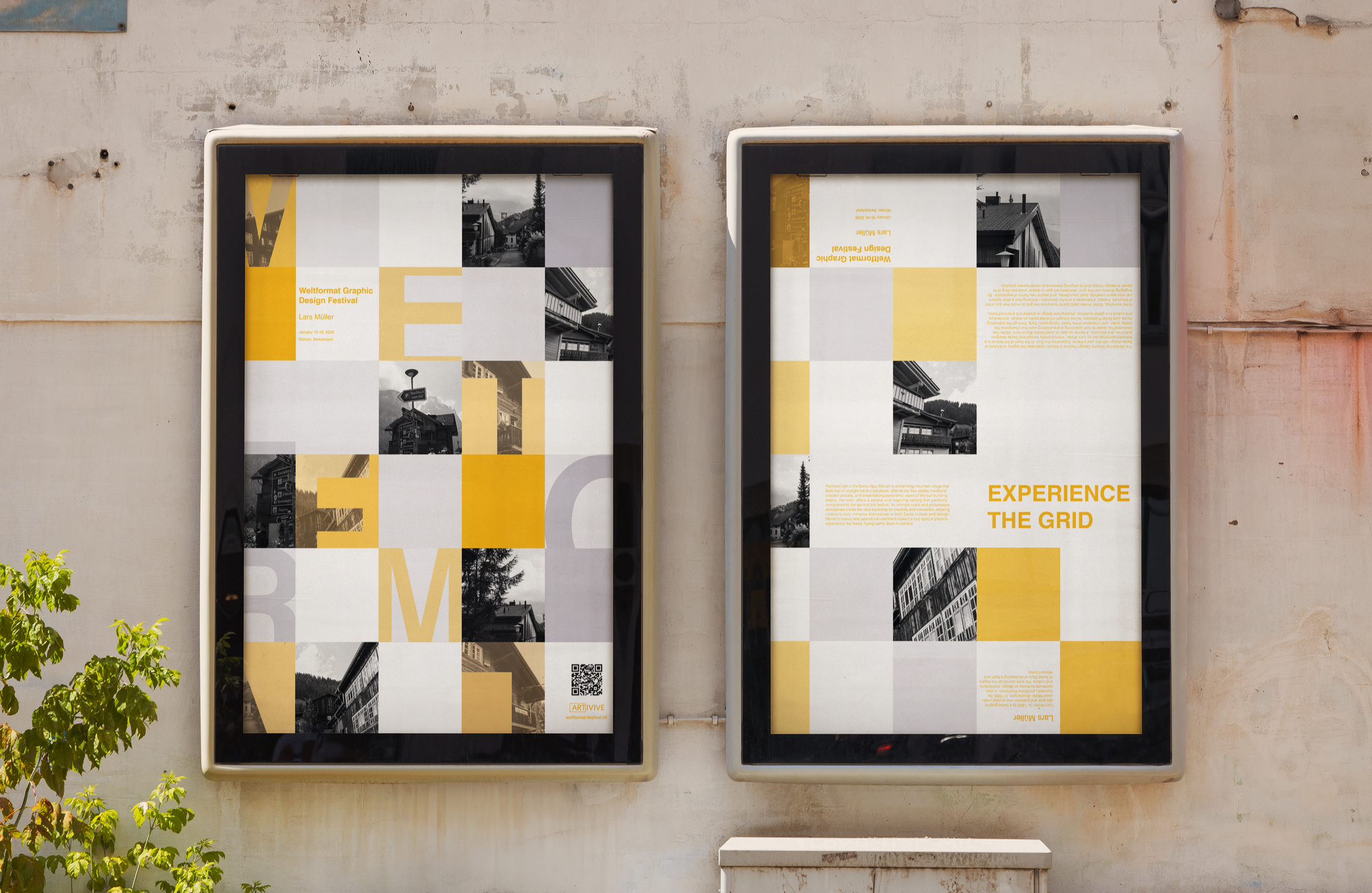
This was a poster project for my Design II class where we were asked to promote a typographic design festival and eventually bring the poster to life with motion. This project pushed me to think about the grid not just as a structural tool but as a visual language that shapes how people experience design. I wanted the poster to feel immersive, something that draws viewers in through its precision, rhythm, and balance. By experimenting with scale, hierarchy, and contrast, I created a layout that celebrates the intentionality behind Swiss Typographic Style while still feeling contemporary and energetic. Every typographic decision, from spacing to alignment, was made to showcase how the grid can both anchor a composition and create movement within it. The final design functions as both a promotional piece and an interactive encounter, encouraging viewers to explore, unfold, and engage with the festival’s theme in a tactile and memorable way.
Print to Motion Poster
Graphic Design II
Fall 2025
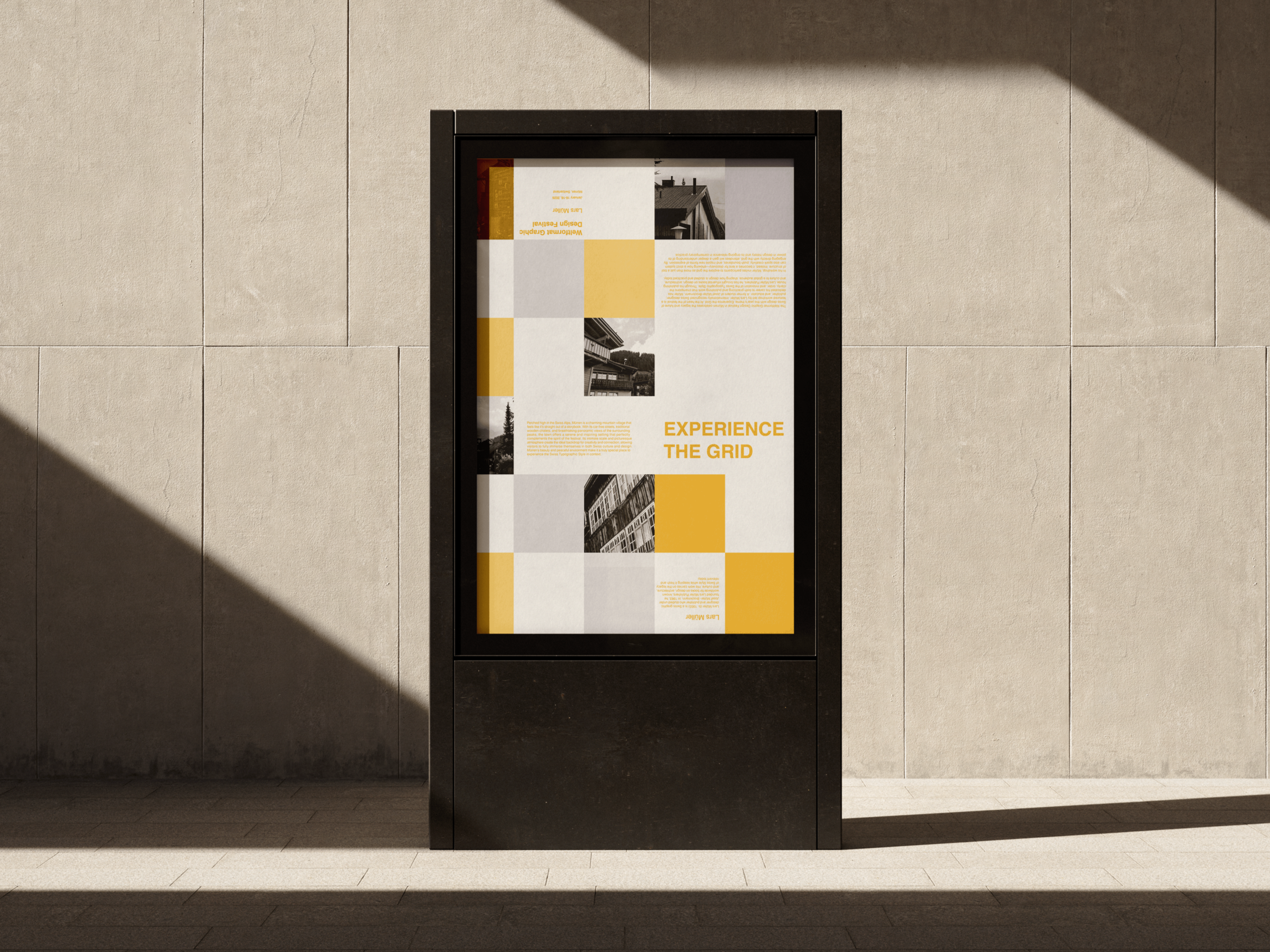
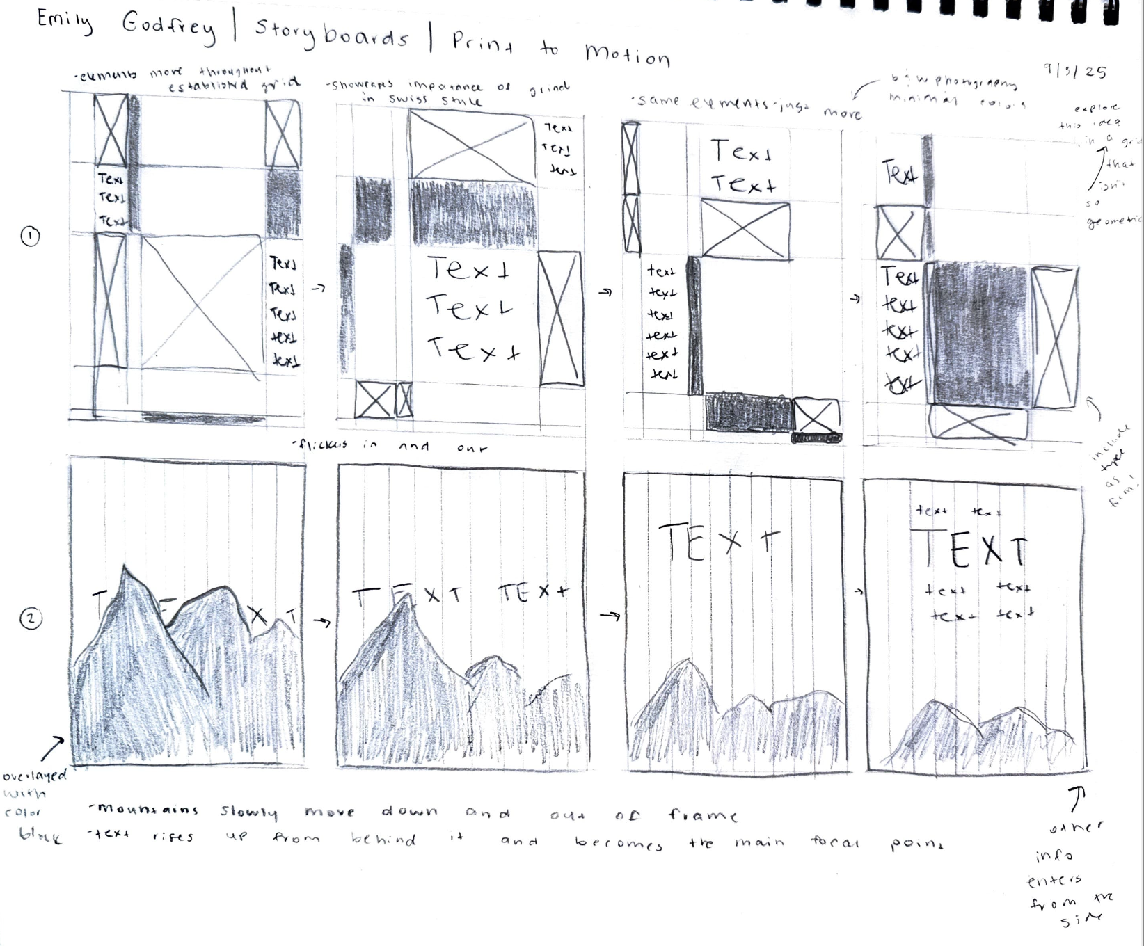
My motion piece was designed to highlight the grid as the central structure of the poster. Because the grid is such a defining element of Swiss design, I wanted the final animation to make that system feel active and intentional. The imagery flashes in and out of different sections of the grid before finally aligning to reveal the festival name, creating a moment of clarity for the viewer and clearly communicating what the poster and animation are advertising.
Process
My process for this project began with background research that helped me define the overall direction of my design. I selected a graphic design festival and was tasked to create a poster that advertised it in a way where typography was the dominant element. Since I had the opportunity to visit Switzerland this past summer, I was deeply inspired by Swiss design and the clean, intentional aesthetic that surrounds it. I knew I wanted to bring that influence into my work, so I selected the Weltformat Graphic Design Festival and chose to feature Lars Müller because of his strong connection to traditional Swiss design. After narrowing my concept, I started by building a mood board and studying successful examples of Swiss typography. We also completed an in class collage exercise to spark visual ideas and begin brainstorming. From there, I moved into Adobe InDesign and Photoshop and began translating my ideas digitally. I had taken many photos during my time in Switzerland, and because photography is such an important part of Swiss design, I wanted it to be a key component in my poster. I chose to use only black and white imagery so the yellow accent color could guide the viewer’s eye and become a strong unifying element. Once the front of the poster was complete, I designed the back in a way that felt cohesive and also kept the foldable grid structure in mind. After finalizing the full layout, my last step was to create a motion animation that extended the visual language of the poster and captured the same rhythm and energy found in the printed design.
-
![]()
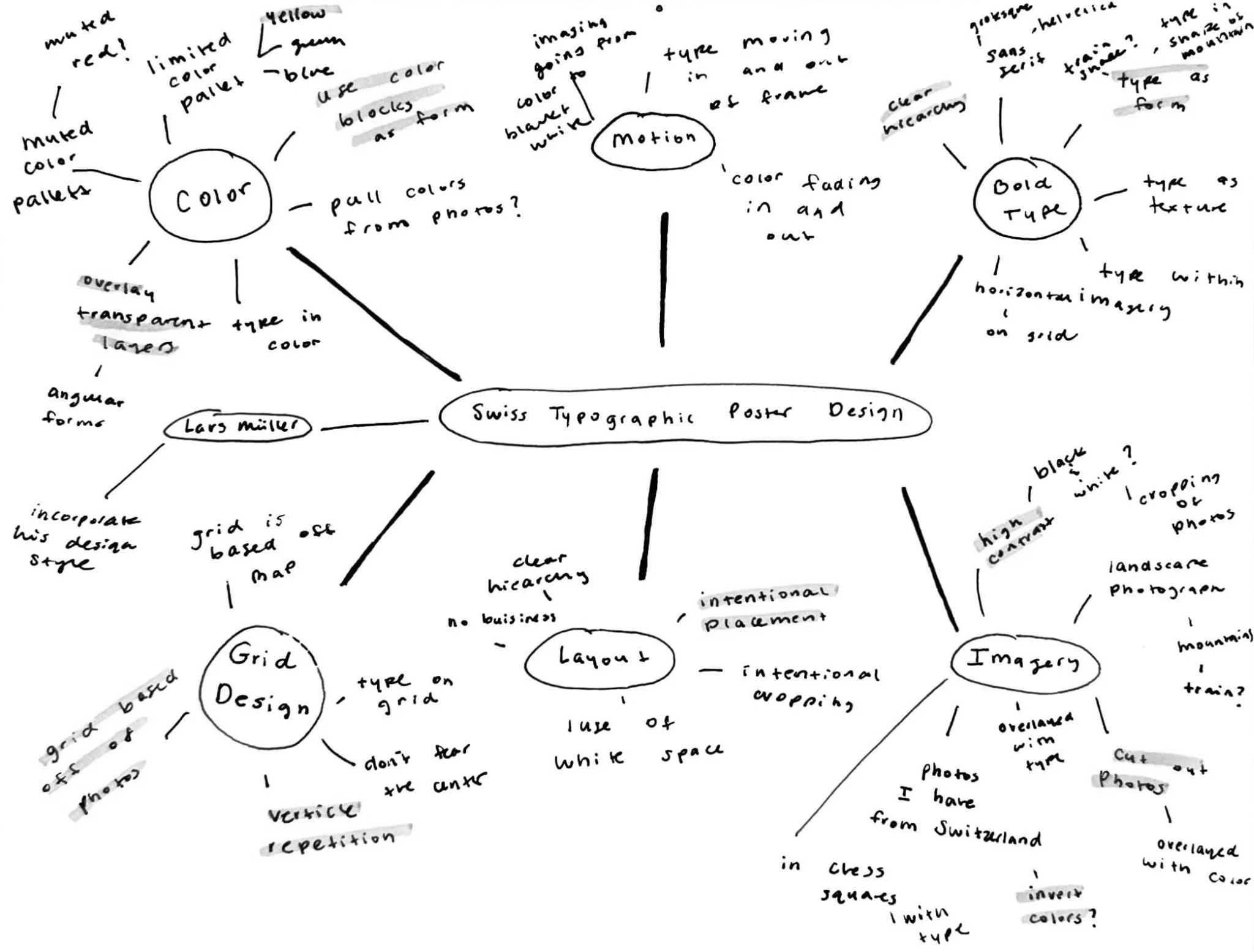
Mind Map
I began with a mind map to quickly generate a wide range of ideas. From there, I identified the key elements that would be most important to my final poster, and the mind-mapping process helped me explore different ways to bring those ideas to life.
-
![]()
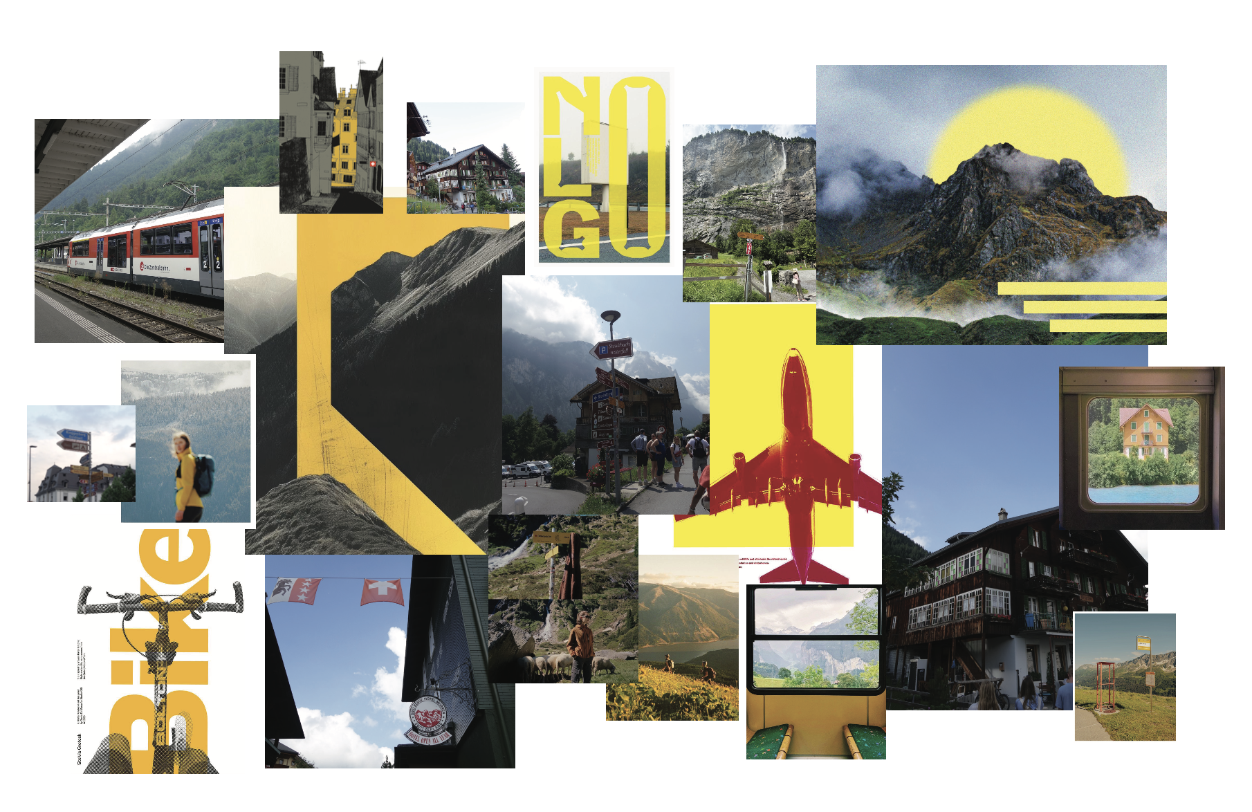
Mood Board
At the beginning of my design process, I created a mood board to help determine the overall style I wanted to pursue. Since I knew I wanted to incorporate my photos from Switzerland, I started with those and built the rest of the board around them. I decided early on that yellow should be a prominent color, so I sourced additional imagery where yellow played a strong visual role to guide the direction of my final design.
-
![]()
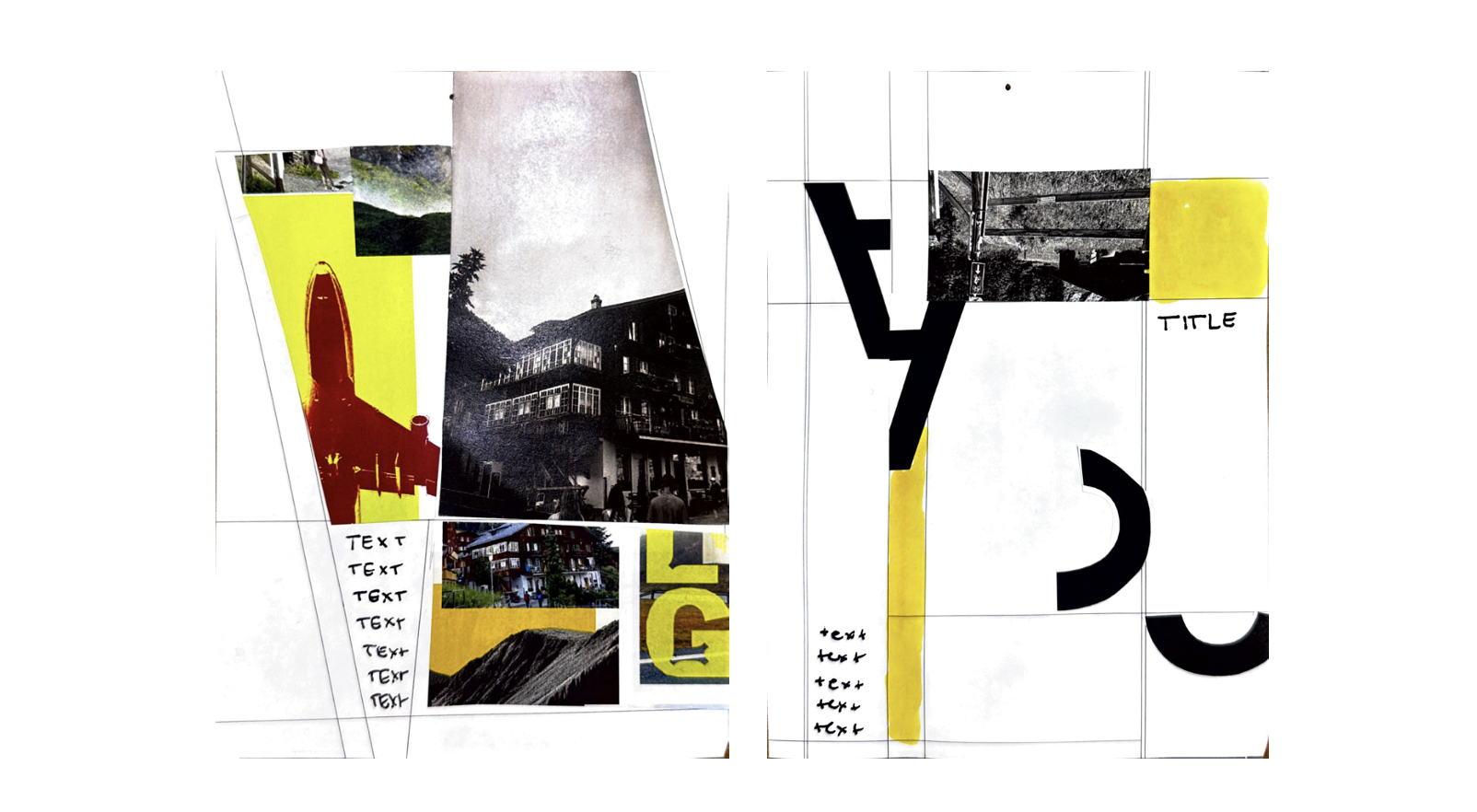
In Class Collages
In class, we did an exercise where we created a series of collages using cut paper, images, and grids we had built earlier. This process let me experiment with typography and imagery from the very beginning and helped me explore different visual directions before moving into the final poster.
-
![]()
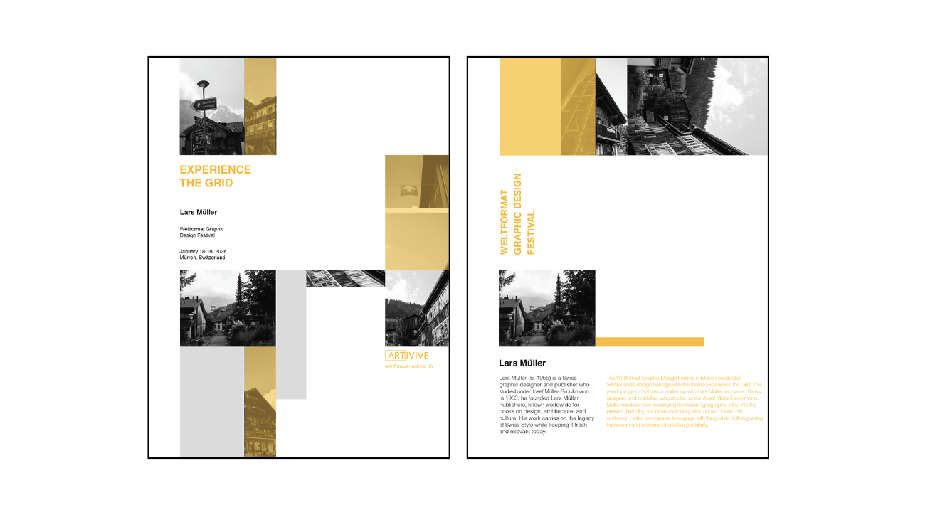
Early Versions
-
![]()
Motion Story Boards
These storyboards helped me brainstorm and think through the direction of the motion piece before I actually began building it, giving me a clear plan for how the animation should unfold.