Grain & Grace Bakehouse
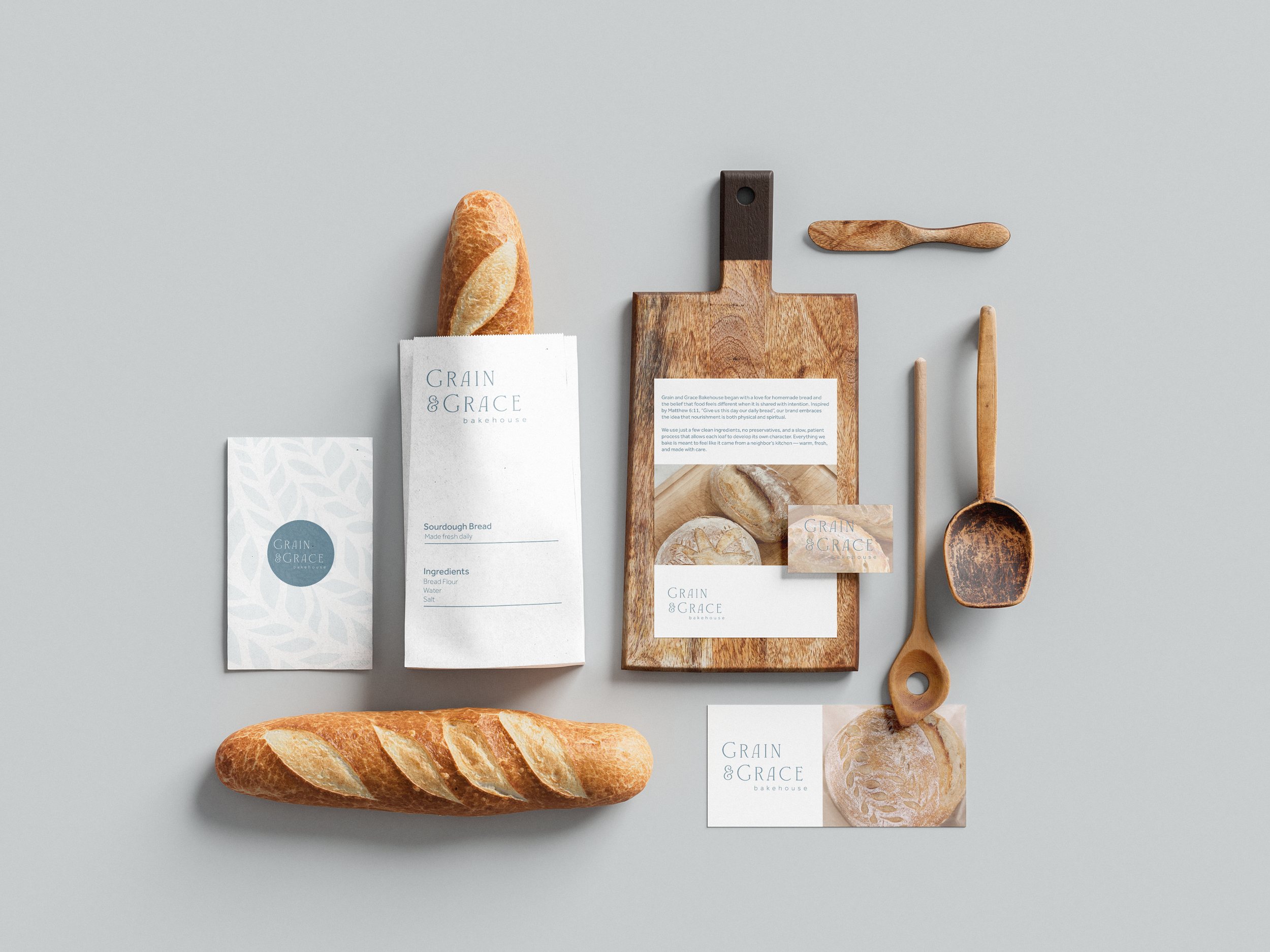
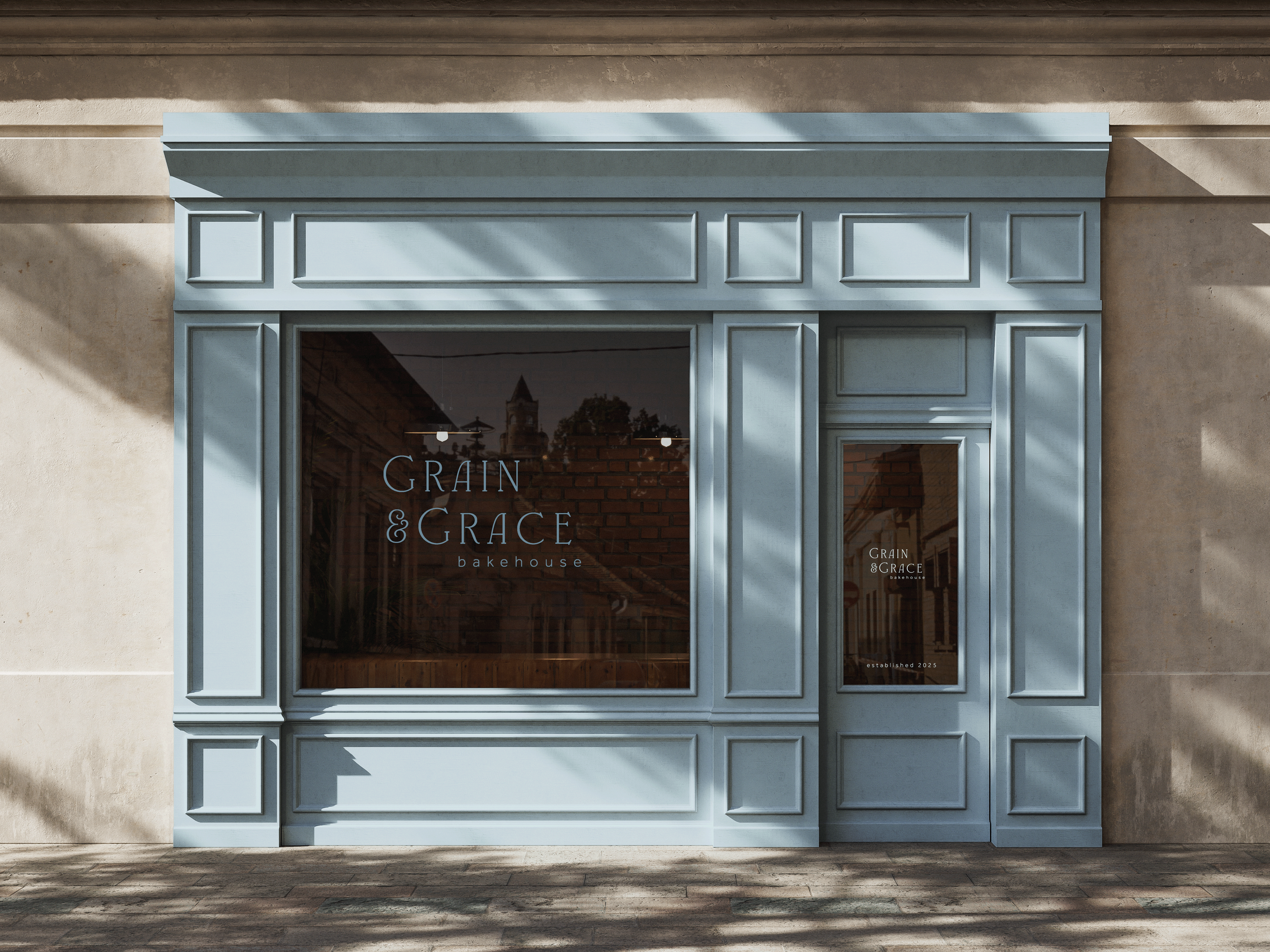
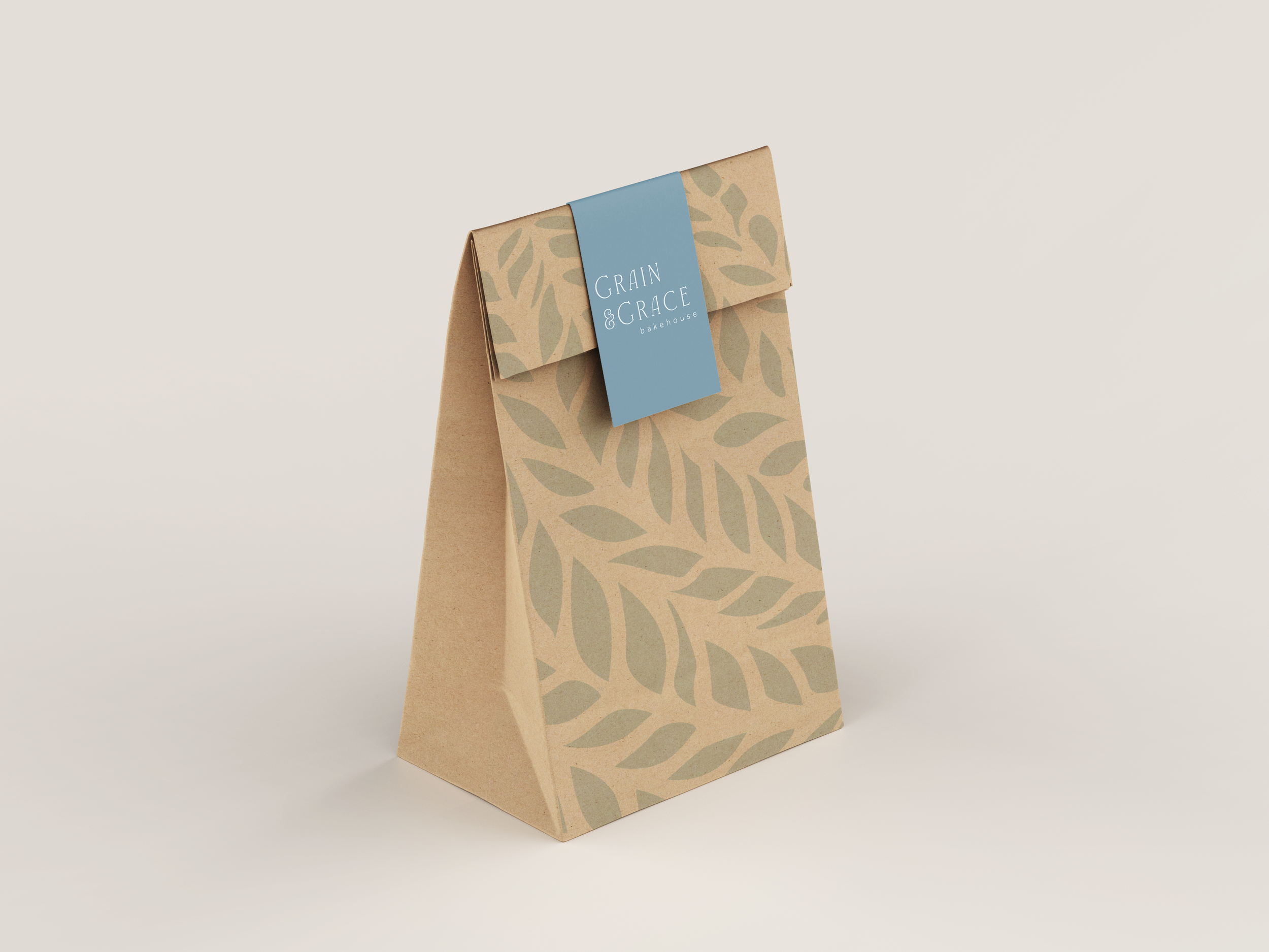
Grain and Grace Bakehouse is a concept bakery brand inspired by the biblical idea of daily bread and my own sourdough baking. I designed the logo, warm color palette, and a custom pattern based on traditional sourdough scoring. To bring authenticity to the packaging, I hand-carved the pattern into a linoleum block and stamped it onto the products, combining clean, elevated typography with a homemade feel.
Brand Identity
Graphic Design I
Spring 2025
Carving Process
-
![]()
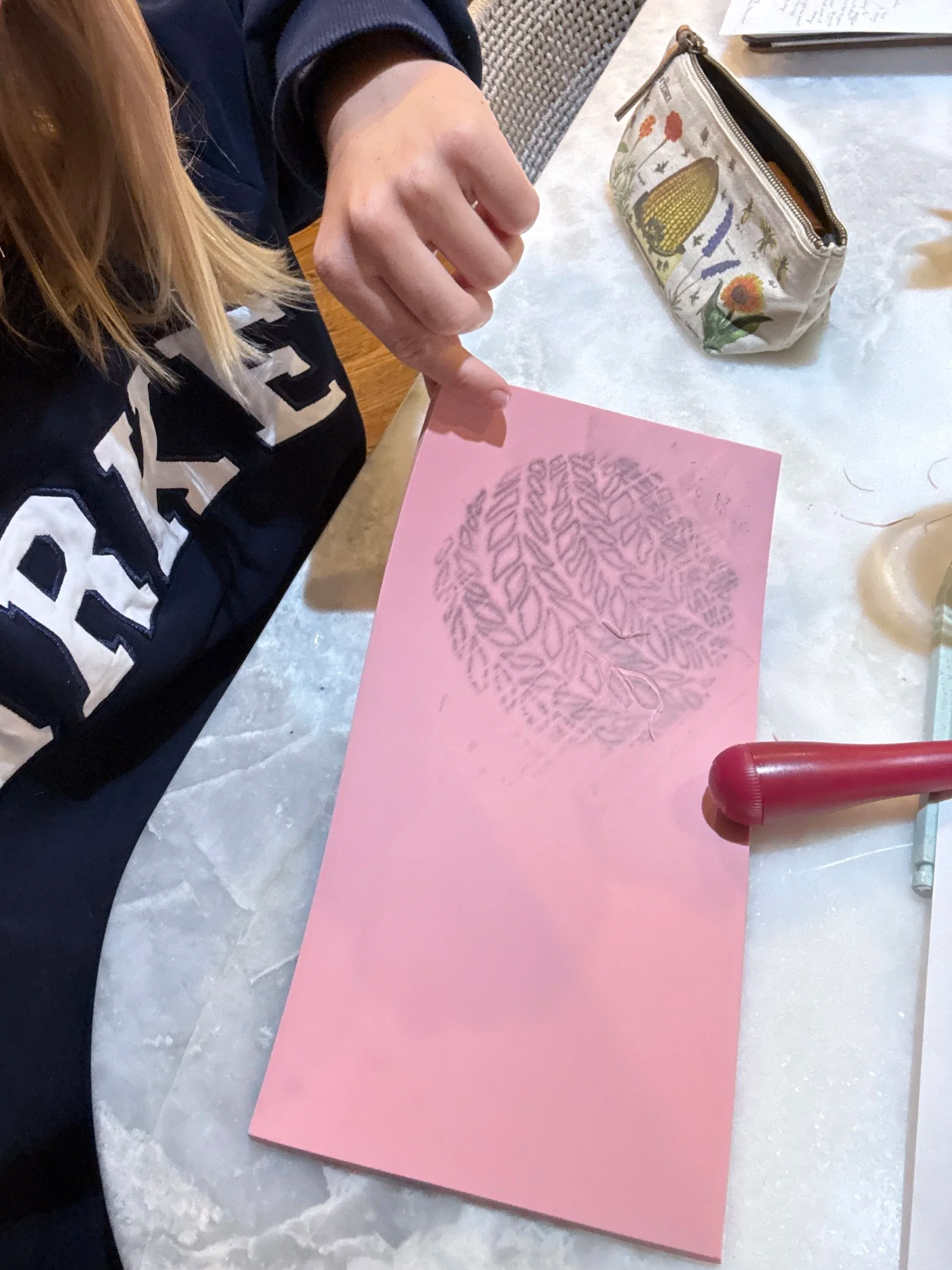
I first started with tracing the sourdough scoring pattern onto my linoleum block.
-
![]()
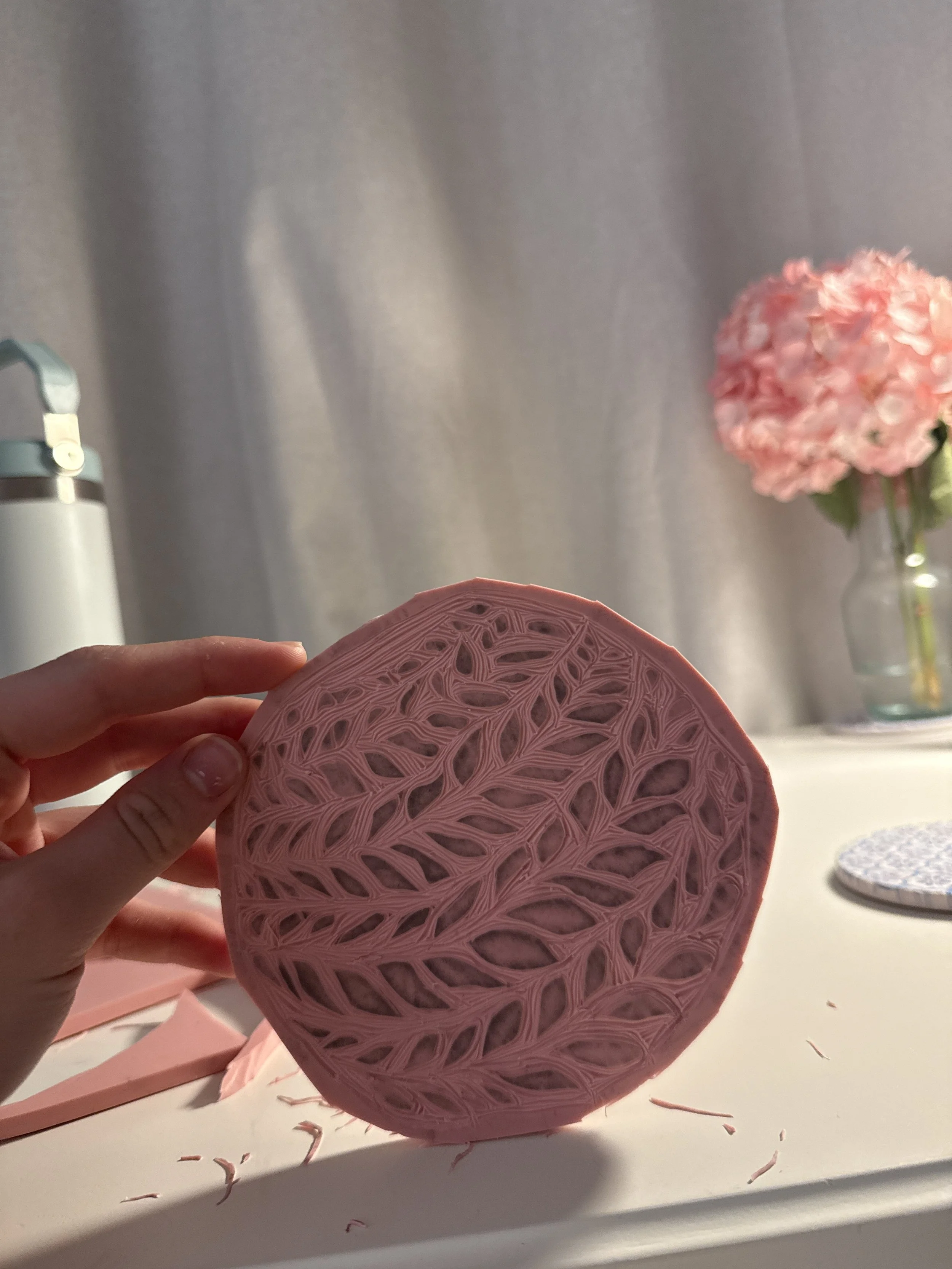
Next, I used a Speedball linoleum cutter tool to carve out the pattern in the linoleum block.
-
![]()
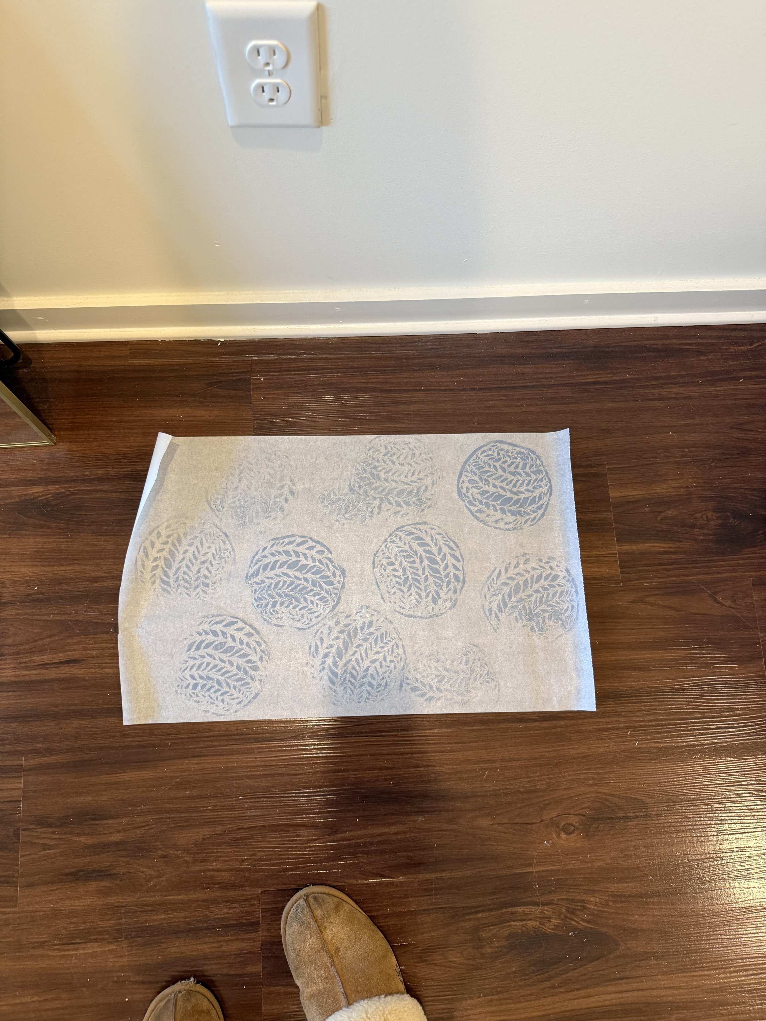
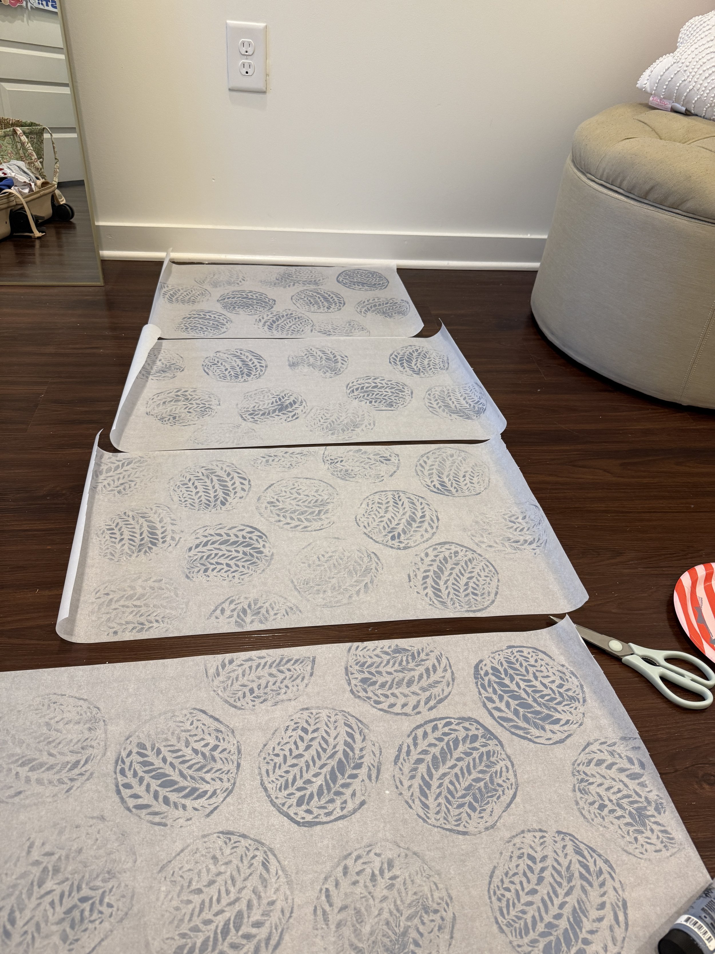
I decided to use paint to create the stamps on the parchment paper.
-
![]()
I first planned to use blue paint for the pattern, but it clashed with the blue bread tag, so I switched to white for a cleaner, more cohesive look.