
Keeler Moody & Associates
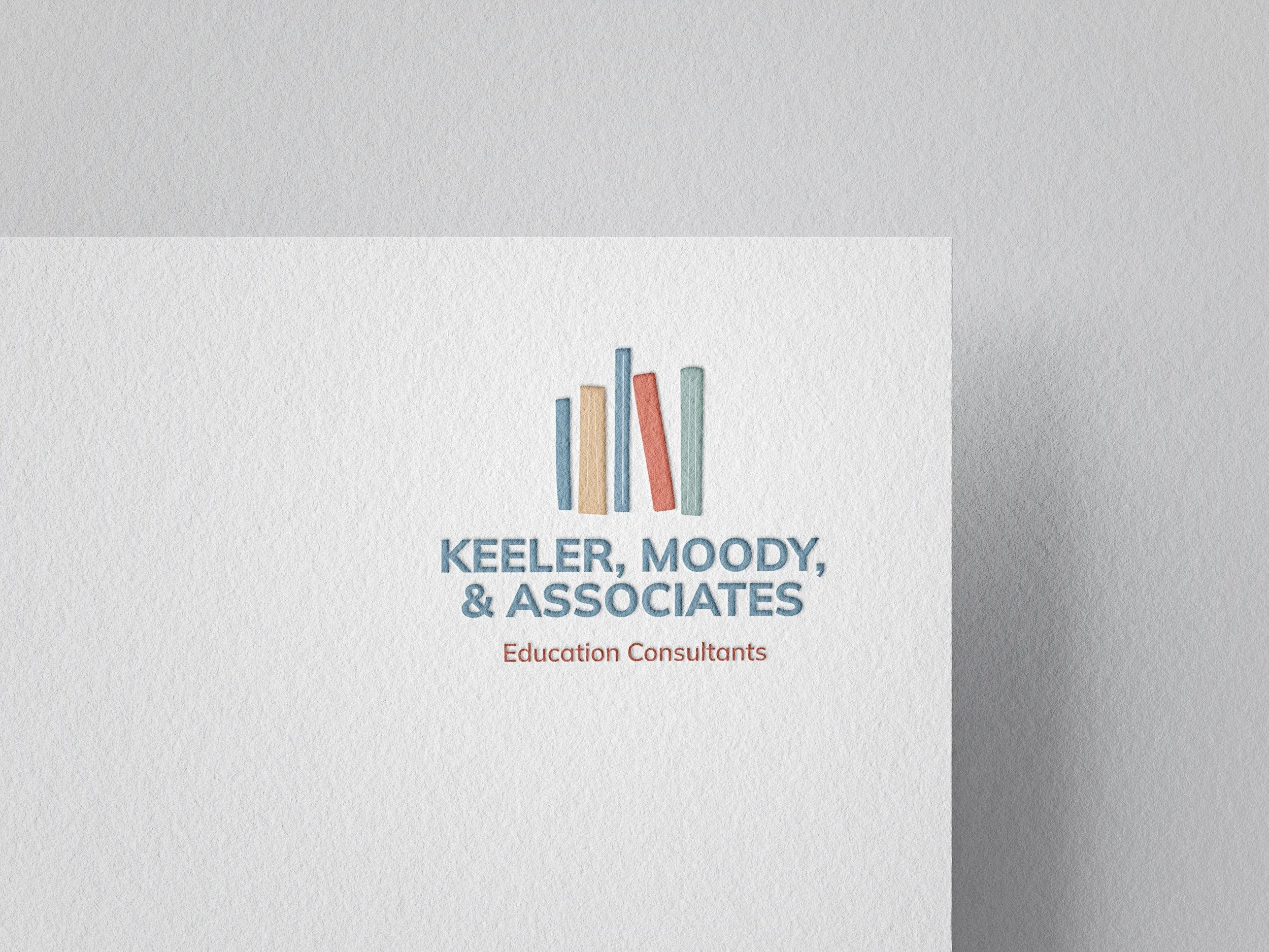
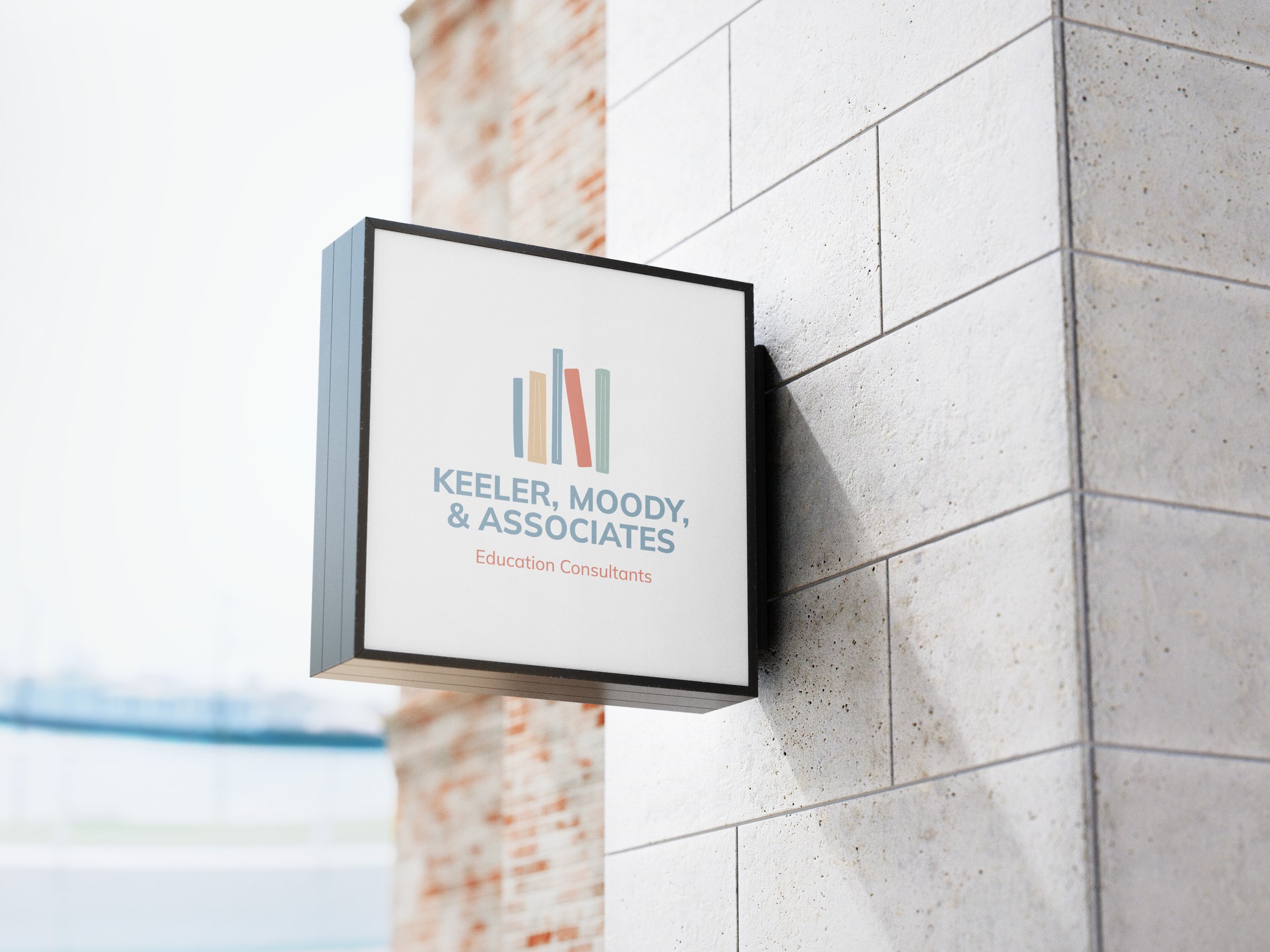
Keeler Moody & Associates is an education consulting firm that partners with schools to strengthen academic vision and leadership. I designed the entire identity and branding for the company. The overall branding needed to feel friendly and inviting, but still maintained and educational and trustworthy feel.

-
Keeler, Moody, & Associates equips schools with essential tools and strategies to thrive. Through division head coaching and consulting, faculty training and development, and curriculum planning and evaluation, we help schools identify their strengths and create actionable plans for growth. With decades of combined experience, Lori Jill Keeler and Katie Moody offer tailored support to strengthen programs, empower f aculty, and deepen parent engagement. In addition to standard packages, customized consulting opportunities designed to meet the unique needs of each school are available.
-
The branding was inspired by the idea that education is at the center of the company. The goal was to create an identity that feels inviting and welcoming, reflecting the supportive and thoughtful nature of Keeler Moody & Associates.
-
The identity balances warmth and approachability with a professional tone through intentional color palette and typographic choices. Overall, the brand suite feels fun and engaging while remaining credible, polished, and professional.
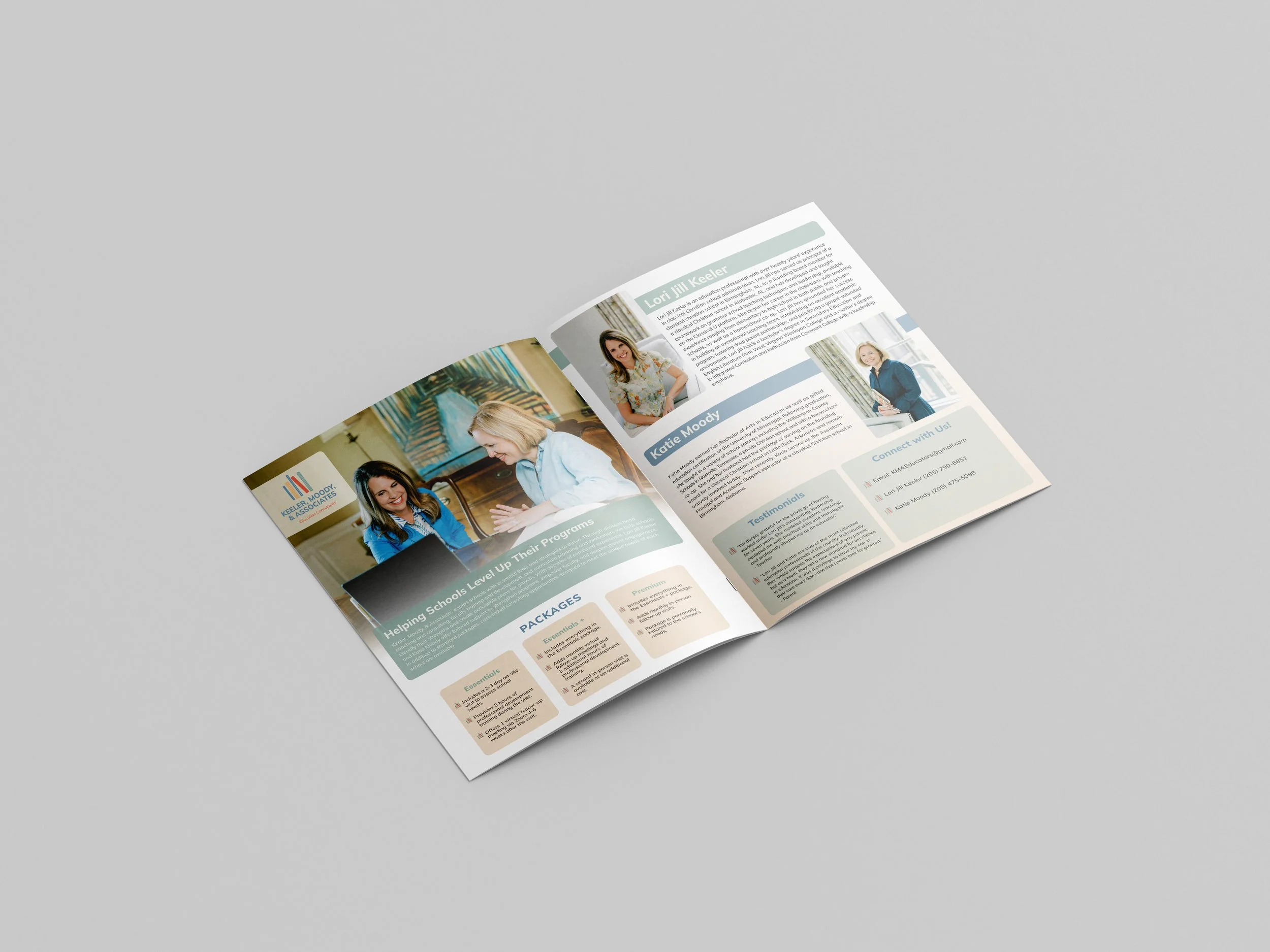
This flyer was designed using the established brand identity, with a focus on balancing clear information and engaging visuals. Key points were intentionally emphasized to make the content easy to scan and understand. The design remains cohesive with the overall brand, incorporating the wordmark as a bullet point to subtly reinforce brand recognition.
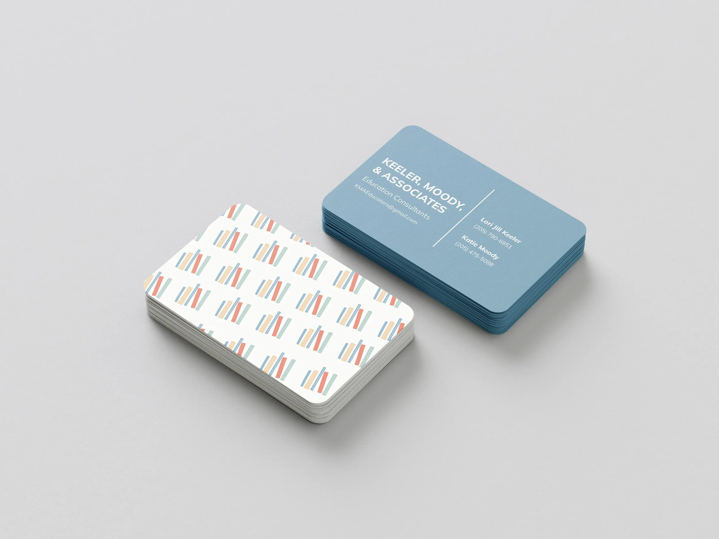
In addition to the flyer, I designed the business cards using the established brand identity. The logo mark was repeated as a pattern to introduce an additional visual element. This reinforced the identity of the brand across all of its products.

I also designed the website for KMA Educators, building upon the established brand identity I had previously created. The goal was to ensure the site felt like a natural extension of the brand while working within its existing visual constraints. Because it is a fully functioning, live website, I carefully considered user flow and overall experience, making sure navigation felt intuitive and seamless. The information was thoughtfully structured to be clear, readable, and easy to digest, using hierarchy, spacing, and typography to guide users through the content while maintaining a cohesive and professional brand presence.